
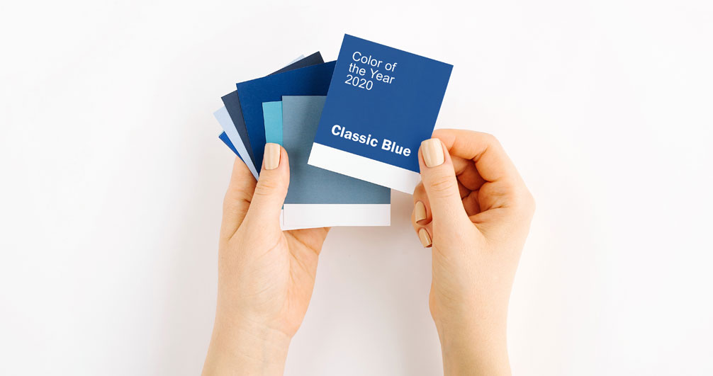
You may not have even realized it, but you’ve been seeing a lot of blue lately. That’s because the 2020 Pantone Color of the Year is called Classic Blue. Not as dark as navy, this shade suggests the color of the sky just after dusk.
The Color of the Year is selected by The Pantone Color Institute, which describes this blue as a color that promotes a “What’s going to happen next” anticipation. Classic Blue asks us, as we move into the evening hours, what will the future bring?
As we begin this new decade, that’s an important question. Interestingly, as forward-looking as Classic Blue is, it actually brings us full circle. Twenty years ago, the first Pantone Color of the Year was Cerulean. This “other” blue was chosen in 1999 to summarize a particular moment in time as well. That was when we were heading into Y2K and everyone was wondering if the world was going to end!
So, when the Pantone Color Institute gathered to decide on 2020’s color, they said it recognized the same feelings of instability gripping the world. The Institute decided on a shade they felt offered confidence, connection, and reassurance that people are looking for.
The Pantone Color Institute
Not only has Pantone named a color of the year for more than two decades, the company created the Pantone Matching System in 1963. This is a trademarked color system used in fashion, printing, graphic design, paint, and more, to manage and categorize the rainbow of colors they use. Each industry uses the same coded number system in order to ensure everything matches the way it should.
Deciding on a Color of the Year
Each year, the Pantone Color Institute decides on the next color through a long and thoughtful process. They takes into consideration both industry and lifestyle trends. They note that the trends they see in color choices often reflect big trends that are taking place in cultures and communities around the world.
Influences in color can come from new technology, travel, politics, the economy, movies, art, media, lifestyles, and much more.
The Color Name
The color name is an important factor in choosing the Color of the Year as well. If you call a color Chocolate Fudge, for example, people will see it very differently than if it’s called Brown Dirt. The message the Institute wants to get across has to be reflected in the name, too.
This year, the Pantone Institute chose a color, and a name, which is restrained yet regal. Classic Blue can also be considered “edgy” and even unusual when used with a variety of tones of blue in fabric, ink, or other materials. (Think of how this blue would look as a car, for example.)
Incorporate Classic Blue into Your Life
To incorporate 2020’s Classic Blue into your home, consider adding this regal color through throw pillows, a vase, candles, or other small accents. If you really want to be daring and dramatic, try a Classic Blue couch, chair, or bedspread – or paint an accent wall or even an entire room with it.
Incorporating the color into your life can be as simple as adding a few Classic Blue clothing items such as a watch band, scarf, or sweater. There are even blue foods to eat. Those that are similar in color to Classic Blue are rich in anthocyanins. These types of foods are thought to boost the body’s defense system against ailments from cancer to cardiovascular disease.
Who knew that Classic Blue could be such a positive addition to your life?
Sunbow Painters
Thinking of making some updates in your home? We can help you choose the perfect paint colors for every room in the house. Contact Sunbow Painters today!